{Real Talk for a sec, if you don't want to hear me vent - skip to the next paragraph...}. Yesterday I woke up on the wrong side of the bed and honestly I was pretty unpleasant to be around. I didn't have a specific reason why, I wasn't upset with anyone or anything - I just didn't feel like being "on" and unfortunately I wasn't able to hide it. Though it may seem on my blog that I’m all rainbows and unicorns - the truth is, I have moments when I want to scream, throw stuff, crawl back in the bed, and be alone - that's just real talk. So thanks to my lovely friends at work {you know who you are, thank you for putting up with me}, the short break from the office, and an oreo frosty from Wendy's, I became less of a crab and put my serious case of poor me aside. I promise, today I've got a new attitude and ready to get back on my unicorn and jump over a few lovely, genius, and sh-mazing rainbows...LOL! Speaking of which...
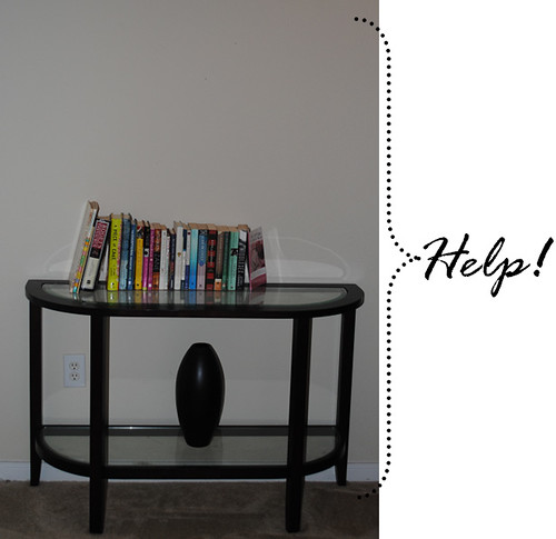
If you know me even a little bit you know I love a project {and any reason to shop and decorate...especially if you're crabby, lol} and as you can see below I need some major help with styling my console table and the wall space above it. This little area is definitely a space that I walk past constantly every day and...ignore it. So this week I plan to use pieces I have around the house {and maybe a piece or two that I find at one of my fave stores - Anthropologie, Z Gallerie, Home Goods, and Crate & Barrel - I know , I know, I'm on a shopping freeze saving for Italy, but one or two things won't hurt....right? } and style this area up.
If you know me even a little bit you know I love a project {and any reason to shop and decorate...especially if you're crabby, lol} and as you can see below I need some major help with styling my console table and the wall space above it. This little area is definitely a space that I walk past constantly every day and...ignore it. So this week I plan to use pieces I have around the house {and maybe a piece or two that I find at one of my fave stores - Anthropologie, Z Gallerie, Home Goods, and Crate & Barrel - I know , I know, I'm on a shopping freeze saving for Italy, but one or two things won't hurt....right? } and style this area up.
I've done a little research and below are some pics that truly inspire me. BUT - I would also love to hear from you on any ideas you may have for my lonely space. What are my must haves? What elements should I not {or should} go without?
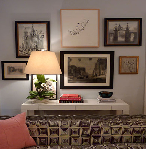
{Love the wall full of framed art...}
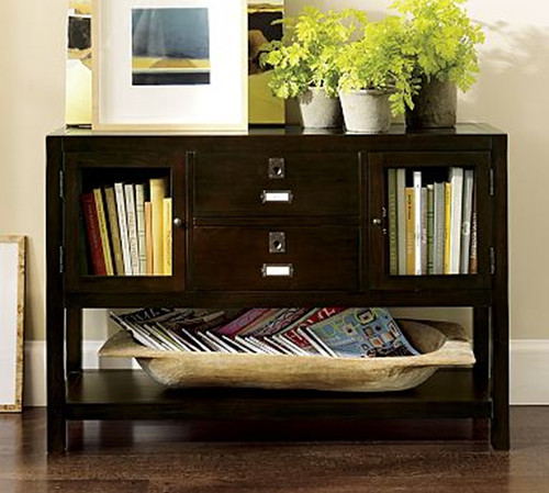
{Love the leaning art, the greenery, and that wonderful wooden "bowl" to hold all my fave magazines...}
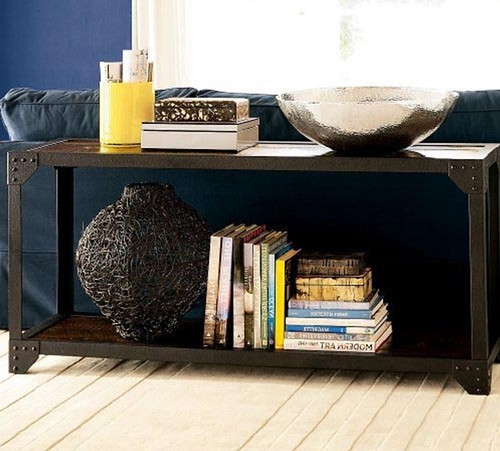
{Love the hammered silver bowl, and the wired vase, and the styling of books here...}
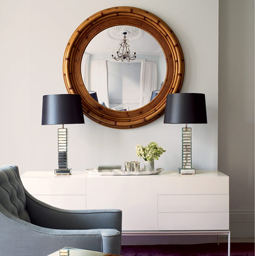
{Love the simplicity here - the gold mirror and matching lamp look...}
So many ideas - how do I decide? I'm sending out an S.O.S!!! Comment below with your suggestions and be sure to come back next week {Tuesday} to see the results.

i really like the wall of pics! i love the randomness but yet it works. unless you have another cluster of pics close by, i think you should go with that. but, i also REALLY like the leaning art and bowl pic too.
ReplyDeleteim pretty sure no matter what, its going to look fabulous ... you have great taste!
I really like a lamp- usually just one- even if I don't turn it on. Have you seen the one at Target that's a clear green with "No. 5" on it? Talk about SH-MAZING!!! The base is $40- still a little pricy for my sale-rack eyes. I've been wondering if I could make it a DIY. Anyways... my two cents :)
ReplyDeleteThanks Elizabeth! I'm definitely doing the wall of framed pics - I love that look and Nate Berkus has a wall a few posts below that I would die for. So that element for sure is something I plan to do! :-)
ReplyDeleteAndrea - I haven't seen the lamp you are talking about - do you have a link, I would love to see it!!
How about stacking the books to one side on the top... stacking both horizontally & vertically. Paint the vase a nice bright color then place flowers in there (either fake or real). A candle would be nice too. Maybe place a big black and white photo on the bottom shelf.
ReplyDeleteTarget always has cute lamps. Agree that it would be a nice addition.
I'm sure it will be cute no matter what you do!
Nikki ;)
I am a big fan of using mirrors to create the illusion of more space. Or, one of my favorite local photographers posted this on her blog yesterday (http://emileebeth.com/blog/?p=1086) (using canvas wall art displays) and it could work beautifully in your space...
ReplyDeleteI agree with Andrea about maybe adding a lamp - greenery and picture frames are always a nice personal touch as well!
Good luck - keep us posted!
Step One: Toss any Twilight books. Step Two: See Step One. Done.
ReplyDeleteI love the idea of either the different size frames or mirrored "things". I am currently loving that trend right now and would LOVE to see how you make it in your style so I can bounce ideas off of you. Always love your ideas.
ReplyDeleteI love the 2nd and 4th pics above. I like the idea of stacking the books. Also, for a project, you could make matching or various colored book jackets for a pop of color. We have a little table (smaller than yours), above which is a large mirror (perfect for checking lipstick on the way out of the door) and on which is a vase with fresh flowers (most of the time) and a little red box (into which we throw keys and stamps). (Ignore the baby monitor on the table--yes, I know she is five).
ReplyDeleteCan't wait to see your pics next week!
Ashley
Wendy's makes an oreo frosty?!?
ReplyDelete