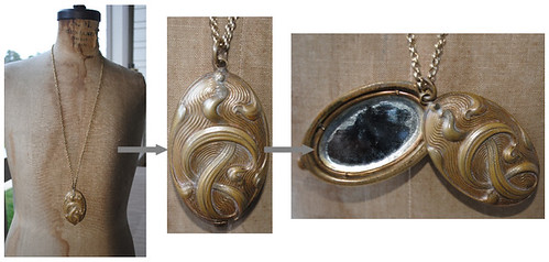
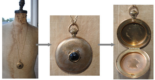
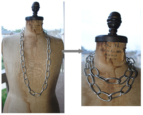
MODAGE is getting a facelift this weekend and I wanted to give you (my faithful viewers) a chance to look at some of the new items that will be posted (inclusive of my flea market/vintage shopping finds) on the site. Additionally, I will be placing most of my current pieces on sale (up to 40% off). So be sure to check out the site this weekend; until then - here's a sneak peak:

Much more to come...
---------------------------------------------
---------------------------------------------
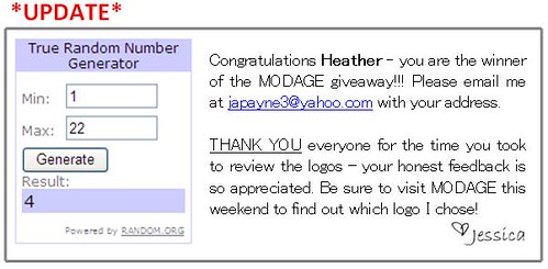
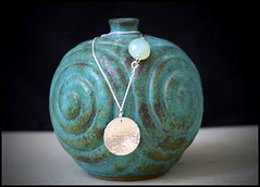
MODAGE GIVEAWAY
I am giving away the following necklace (18 inch, sterling silver chain with a hammered domed sterling disc, and lovely chalcedony bead at the clasp) to one lucky random winner!
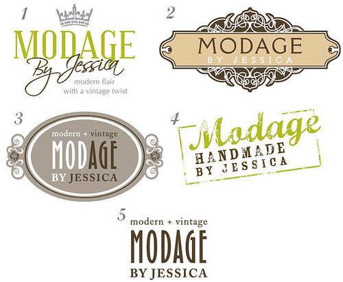
As MODAGE is getting a facelift, I need a new logo, and need your help!
Here's how you can win:
1) Follow me on Twitter, Facebook, or Bloglovin' and leave a comment (below) telling me which one you are following me with.
-AND-
2) Include in your comment the number of which logo you like the best (below), and why.
All entries are due by NOON EST on Friday, March 19, 2010. I will select the winner at random later in the day on Friday, March 19 and will post it here and email the winner. PLEASE LEAVE A VALID EMAIL ADDRESS WITH YOUR COMMENT SO THAT I CAN CONTACT YOU.
Can't wait to get your feedback - spread the word!!! Have a good day - make it lovely!
i loooooooove 3!
ReplyDeleteJessica,
ReplyDeleteHey! I love logo #4 and #3. They are both really unique looking. I don't think you can go wrong with any of these designs :)
Lauren
I think 3 suits you best!
ReplyDeleteAshley
I LOVE the new pieces! Can't wait to see more. Great job. Also, I like the new logos. I think the tiara fits you the best, but vote for #3.
ReplyDeleteI like # 3 and #2.
ReplyDeleteThelma
Your logos are great, first of all. I really think #3 "modern+vintage MOD•AGE" is the best.
ReplyDelete1. It's not 100% easily understood what modage means, so I think the explanation is needed.
2. I like the subdued colors: they are very in. Still if you wanted to play up that background with the tan tones you have in logo #2, or the green in logo #4, that could be interesting.
Nice!
-Hilary
I vote for logo number two. Love your stuff.
ReplyDeletemcgregorr@bellsouth.net
Jessica,
ReplyDeleteI follow you on twitter! :) And I really like number 3. I think it's an awesome way of telling people how you got the name and the design is really really awesome. My 2nd favorite is #4. I really like the vintage look of it.
:) you're a good blogger.
Laura
I did a second look to see if I would change my mind...and I am still drawn to option 3...and i am kind of in love with your locket - i LOVE lockets. I have one from JCrew (of course, hehe) and i wear it all the time!
ReplyDeleteI like #5
ReplyDeleteI like option 3....
ReplyDeleteBrenda C
Hello Jessica.
ReplyDelete1) I follow you through your blog.
2) I am crossed between #1 & 3. But if I can to chose only one... I would be #1. I think the tiara is a good look for you.
Thanks
Lisa W.
1) I follow you on twitter, bloglovin and facebook. That's because I love your blog!!!
ReplyDelete2) I love #3 but I like it even more if you could add the green. I'm liking that color. I'm always always a big fan of vintage, so I'm drawn to #4 too.
myfashionstudio@gmail.com
Wow, these are all great....but I think my favoirte is #3 (#1 running very close behind).
ReplyDeleteLove your blog, I find so much inspiration!
candles521p@hotmail.com
Jessica, I follow you on Facebook, and I love number 3! I love the neutral colors, and the design is classic (with the oval) but I think the colors and side designs make it contemporary. Understated but unique :)
ReplyDeleteGood luck with the new logo, and can't wait to see the new jewelry on Modage!
Jessica,
ReplyDeleteI'm really feeling #3. They are all great, it was hard to choose just one! Great job, can't wait to see your feature in Oprah magazine. :)
I LIKE #3. IT'S CLASSIC AND MODERN! GREAT JOB, BUT I DONT EXPECT ANYTHING LESS. LOVE U GIRL. TRICE
ReplyDeleteI think they are all very nice but #3 would be my pick. It's not too trendy like the crown one which could be dated down the road.
ReplyDeleteI really like #3.
ReplyDelete#4 looks too much like the Ornimanta logo.
Jessica - Love the new logos. My favorite is #4 with #3 a close second. I like the touch of green and stamped look. I can't wait for the new jewelry to go up. I don't have a locket necklace but quite certain I need one. I follow you on facebook, its like my morning coffee/coke!
ReplyDeleteTracy
#3 with #1 in 2nd place. I follow you on FB, of course!
ReplyDeleteSasha
Jessica,
ReplyDeleteI like both #3 and #1 and can hardly choose, but my numero uno selection goes to.....#1. Why?
1. I like the flair and hint of color. The color makes it a bit more modern
2.With #3, for those phonetically challenged, they might promote Mod-AGE. It's vintage, but the modern doesn't shine through as in #1.
3. And finally, you're a princess on the way to becoming a Queen and nothing suits a queen better than a tiara (as in #1).
There you have it!
Paula
I love love love #1 !!!
ReplyDelete